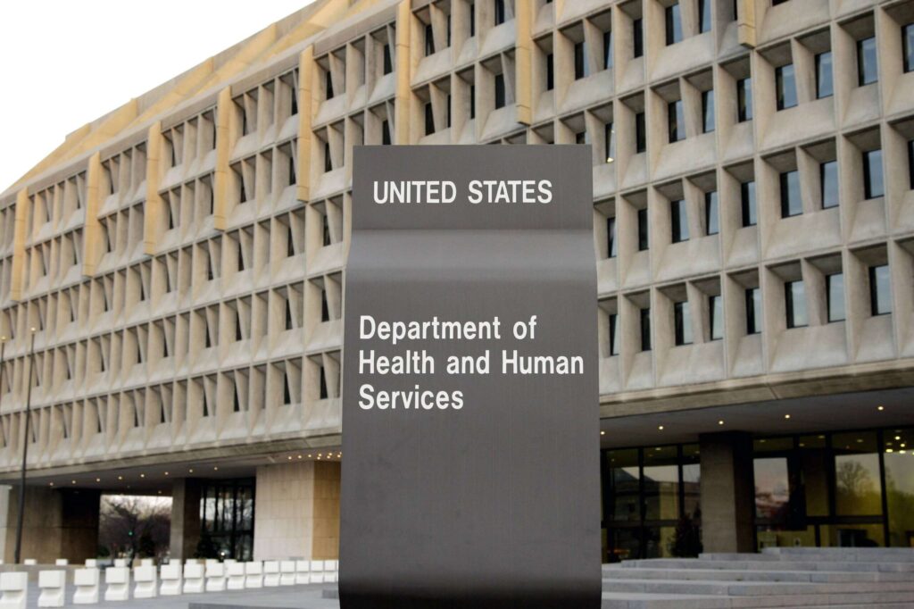
Hospitals treat the sick and wounded. But they can be dangerous places. One Department of Health and Human Services unit aims to reduce patient and health care workforce harm by 50%. So a dashboard was set up that collects safety information. Join Craig Umscheid, director of the Center for Quality Improvement and Patient Safety at the Agency for Healthcare Research and Quality The Federal Drive with Tom Temin For details.
Tom Temin: And give us an idea of what you’re trying to do here. I mean, what is the extent of hospitalization, patient infections, and health care? It’s a really big country with a lot of hospitals.
Craig Umscheid: Most of us who have been patients in hospitals or have had family members as patients in hospitals know that hospitals can be a dangerous place and all kinds of safety events can occur from healthcare-associated infections such as central line-associated bloodstream infections, where the medication is taken Safety errors Which may occur in the hospital. So, there are several studies, especially recent studies, that indicate that up to 25% of hospital admissions have these safety events occurring. And what we’re trying to do at the Agency for Healthcare Research and Quality is to address and reduce these safety events.
Tom Temin: How can you obtain information at a national and global level on this topic? I mean, are hospitals required to report infections or how do they know what is happening?
Craig Umscheid: Yes, it’s a great question. So we set up the National Healthcare Safety Dashboard to allow us to track our progress in improving safety over time. The dashboard includes data from a number of different data sets. So some of these datasets are from our agency. They look at patient safety indicators, for example, adverse events that might occur during a surgery or procedure like increased bleeding, which you might not expect, or acute kidney injury, which you might not expect. Some data comes from hospitals reporting safety measures to insurance companies like Medicare in order to receive reimbursements. So some of these safety measures are measures like do you have infections when you have a hip implant or a knee replacement? Other measures are measures from hospital staff who complete surveys about safety aspects of their environment. So, for example, do their supervisors support a culture of safety? Do they have enough staff in their healthcare facilities to provide safe care? So the metrics actually come from different data sets, both from our agency and from CMS, CDC, and other groups.
Tom Temin: right. Because patients enumerated a lot of things that could happen with patients. But hospital staff, nurses, doctors, nurses, everyone, they’re handling dangerous equipment that in some cases, or I think in mental cases, patients themselves can cause harm. So the workforce is a big part of this study.
Craig Umscheid: they. What we have come to understand over the years is that it is very difficult to provide safe patient care without providing a safe environment for the healthcare workforce. So this dashboard tracks both patient safety measures as well as healthcare workforce safety measures. The first set of healthcare workforce safety measures we evaluate comes from patient safety culture surveys our agencies conduct. Hospital employees are required to complete surveys every two years about their safety culture. They provide this data voluntarily. This is the data we report.
Tom Temin: This effort then brings together these multiple databases, some of which are created at the federal level, some of which may be created at the state level, and essentially puts them in one place.
Craig Amshed: exactly. It allows us to track our safety progress over time. So one of the things that we’ve noticed during the COVID pandemic is that there’s a real increase in adverse events in 2020, in 2021. And the Secretary of Health and Human Services, Javier Passara, has asked health care systems across the country to recommit to patient safety. We have assembled the National Patient and Workforce Safety Action Coalition to align federal agencies around this goal. We’ve compiled resources to help healthcare systems address safety in their organizations. This dashboard is part of that effort to help us track our progress over time. We have an ambitious goal of reducing adverse events by 50% by 2026, compared to the peak of adverse events in 2021 at the height of the pandemic.
Tom Temin: What are the trends since the peak of the pandemic? Are they going down slower than you want?
Craig Umscheid: It’s a great question. So our data at this point extends back to 2022. We will load data from 2023 soon. We see that the peak of negative events already appears to be occurring in 2020 and 2021. And we’re seeing some improvements in patient safety in 2022, ranging from roughly 10% reductions in adverse events to 15% reductions depending on which dataset you use.
Tom Temin: We’re speaking with Dr. Craig Amshed. He is the Director of the Center for Quality Improvement and Patient Safety. This is part of the Agency for Healthcare Research and Quality at HHS. First of all, I wanted to ask about the data presented. Is this available to the public or only to HHS staff or whoever can see this data?
Craig Umscheid: The National Action Alliance for Patient Workforce Safety website is available to the public on the AHRQ website. It’s ahrq.gov, and you can find the National Action Alliance website on the home page. On the National Action Alliance website, you can find a section on measuring safety. If you look at this section, you will see the control panel there. Therefore it is available to the public.
Tom Temin: It is one thing to measure and examine the problem. What is the feedback mechanism so that you can detect and go after the biggest damage cases, and how do you turn things around?
Craig Umscheid: Yes, it’s a great question. There are a number of priority safety measures that we’ve tracked over the years, and these are actually the safety measures that we continue to track and that we’ve seen a real increase in recent years. This is our priority focus and we have seen improvement. A big part of achieving improvement is for health care systems to conduct self-assessments of basic safety. We provide an example of these types of self-assessments on our website. Once a healthcare system performs a basic safety self-assessment, they can understand where gaps exist in their healthcare system. We have a range of tools, resources and improvement initiatives available to hospitals and healthcare systems to help them address these safety gaps.
Tom Temin: I think CMS is going to be a source of a lot of information here because they pay for a lot of health care and they know what they’re paying for. Everyone spends 50% of their training time programming for Medicare and Medicaid. Using these codes, they can see what could be a cure for adverse conditions that were not the original reason for the health care need, which would be the type of thing you are trying to get to. Is a CMS a big contribution here?
Craig Umscheid: You are absolutely right. The Content Management System (CMS) is an important contributor to this dashboard. So, two of the datasets that we have in this dashboard are from our agency. Two of the datasets are collaborations between CMS and our agency, as well as the Center for Disease Control (CDC), which also provides data for one of the datasets.
Tom Temin: And are you looking at maybe data analytics and maybe a little touch of AI here to discover trends, for example geographic trends or trends around poor outcomes or events with certain procedures, or that kind of thing, or the use of certain technologies or medications? I mean, there seems to be a lot of potential subsurface discoveries here.
Craig Umscheid: Yes, it’s a great question. So what we’ve tried to do is make the views on these dashboards very clear. So the default setting for the dashboard is to be able to track performance on these safety measures year over year over time. But there are different functions that allow you to break down performance on these safety metrics by variables such as race or ethnicity, type of insurance, or region of the country. This can allow you to better understand how safety is progressing based on these different variables.
Tom Temin: By the way, what is the biggest damage caused? I think it’s an infection, for example, after surgery.
Craig Umscheid: Right now, our dashboard looks specifically at safety events in acute care hospitals, and some of the most common harms we see are falls due to injury, and pressure ulcers that occur in patients who are admitted to the hospital. They may be weak and have difficulty getting out of bed. They stay in the hospital for a long time and start developing pressure ulcers. Hypoglycemia is also a major patient safety event we see in hospitals. This is often due to patients fasting for various procedures. They may be diabetic and may be taking too much insulin and not getting enough food during their hospital stay. These are three of the big inpatient events we see. But you’re right, other common safety events include healthcare-associated infections, other medications, safety errors like bleeding from anticoagulants, and giving too much opioids that cause drowsiness. We see errors related to surgeries and procedures. We see blood clots. These are all very common mistakes that occur during hospitalization.
Tom Temin: And how do you get the word out to affected organizations that, hey, this is a resource that you might be able to hold up a mirror to?
Craig Umscheid: So, for many organizations, they track their data in real time. So this dashboard is more for policy makers to understand trends and safety over time across our country. Patient safety advocates, whether patients, families or professional associations, want to understand the progress we have made in safety over time. Most importantly, this is a really important resource for us in this National Action Alliance to be able to track our progress toward our goal of reducing harm by 50% by 2026.
Tom Temin: And have you ever logged into your dashboard and looked around for your curiosity?
Craig Umscheid: definitely. Yes, I do it regularly. We launched the dashboard in early December. We’ve followed this closely over time, and it’s just a starting point. We will add more recent data at the beginning of the next calendar year. These data will reflect information from 2023. We also want to include new measures not only from acute care hospitals, but from other health care settings such as nursing homes and ambulatory care. We would like to include more health care and workforce safety data as well, such as data from OSHA, Bureau of Labor Statistics. There is a lot to come.
Copyright © 2024 Federal News Network. All rights reserved. This website is not intended for users located within the European Economic Area.


